DBO Logo Hunt, continued.
by ncsuDuncan ![]() , Tuesday, February 26, 2013, 21:20 (4075 days ago)
, Tuesday, February 26, 2013, 21:20 (4075 days ago)
Great work so far, everyone! I am amazed and delighted at the ideas I've seen pop up in the thread - there are some really talented artists in our midst!
Below you'll find a grid that should help you get an idea of what has already been posted.
Note: I made the images by opening the entire thread, saving the web page, then taking a screenshot of the resulting folder. I deleted most of the joke images, desktops, and photographs and also split a few of the images into multiple files. IF I MISSED YOUR LOGO FOR SOME REASON, TELL ME. Likewise, if you think your image is poorly represented below, tell me! This was just something quick and dirty I threw together to give us an easy way to look at everything at comparable sizes.
![]()
![]()
A few thoughts from the DBO admin team:
- We REALLY want to incorporate the Bungie.Org logo, so henceforth let's focus on designs that feature it in some way. (That said, the other ideas are still awesome and we'll definitely consider them for other DBO-related imagery - like t-shirts!)
- No Bungie swoosh, please. (Contrails are pretty cool though.)
- Let's try to avoid direct usage of the Destiny tricorn. (Or anything else simply copy/pasted from Bungie imagery. We won't disqualify designs on this basis - just be aware that, if chosen, some features might have to be redrawn.)
- Try not to be dependent on text unless its an integrated part of the design.
- Try to remember this could be used for very small things - avoid important tiny details.
-------
Remember: This is a collaboration, NOT a contest. I highly encourage iterating on each others' ideas (provided you're not trying to pass them off entirely as your own, of course). Feel free to post new designs in this thread (the old one is starting to get a bit unwieldy).
You have until Friday before the DBO admins convene and select a final logo (success will be signaled by white smoke).
Above all else: Have fun with it!
I'm feeling a little left out here Duncan.
by bryan newman ![]() , Kentucky, Tuesday, February 26, 2013, 21:26 (4075 days ago) @ ncsuDuncan
, Kentucky, Tuesday, February 26, 2013, 21:26 (4075 days ago) @ ncsuDuncan
Did you not like my shirt?
I'm feeling a little left out here Duncan.
by ncsuDuncan ![]() , Tuesday, February 26, 2013, 21:31 (4075 days ago) @ bryan newman
, Tuesday, February 26, 2013, 21:31 (4075 days ago) @ bryan newman
Did you not like my shirt?
Nah, you're in there - it's one of those Magic Eye™ stereograms. Cross your eyes and try to look through your monitor.
If you still can't see it, call your optometrist.
I'm feeling a little left out here Duncan.
by komokasi, Tuesday, March 05, 2013, 21:56 (4068 days ago) @ bryan newman
here is a link i uploaded it onto my facebook
how do you post pictures? new here?
Does the black smoke mean you're undecided...
by Xenos ![]() , Shores of Time, Tuesday, February 26, 2013, 21:26 (4075 days ago) @ ncsuDuncan
, Shores of Time, Tuesday, February 26, 2013, 21:26 (4075 days ago) @ ncsuDuncan
...or is my house on fire?
I can't decide.
by biggy ![]()
![]() , Tinseltown, Tuesday, February 26, 2013, 21:27 (4075 days ago) @ ncsuDuncan
, Tinseltown, Tuesday, February 26, 2013, 21:27 (4075 days ago) @ ncsuDuncan
Maybe we should just Nascar it and use all the logos. Would make for some pretty sweet jackets.
We can get Marty to plaster these all over his jacket next time him and Harold are on stage.
That's why they looked so awkward...
by Xenos ![]() , Shores of Time, Tuesday, February 26, 2013, 21:30 (4075 days ago) @ bryan newman
, Shores of Time, Tuesday, February 26, 2013, 21:30 (4075 days ago) @ bryan newman
...they were wondering why they didn't have patches all over their jackets.
Graecum est; non legitur
by INSANEdrive, ಥ_ಥ | f(ಠ‿↼)z | ᕕ( ᐛ )ᕗ| ¯\_(ツ)_/¯, Tuesday, February 26, 2013, 21:41 (4075 days ago) @ ncsuDuncan
(It is Greek (and therefore) it cannot be read.) <- Latin Title Text
Would it be allowable if we had our own Latin phrase with our logo? Or am I thinking about this to much? For the sake of conext - "If this ring will make us brothers - what will destiny do?" is what sparked this line of thought . It also might help point a direction of thought design wise, as we could incopreate it as part of the design. Not all a bad thing since we have so little to go on right now.
Some Exsamples:
- Sic itur ad astra - "Thus you shall go to the stars"
- Ex astris scientia! - "From the Stars, Knowledge"
- Suos cultores scientia coronat - "Knowledge crowns those who seek Her"
Preferably latin not used from existing (be it real or fictional) institutions (such as the above), and not from Google Translate to negate the risk of unknowingly making a fool of ourselves in latin.
Graecum est; non legitur
by Xenos ![]() , Shores of Time, Tuesday, February 26, 2013, 21:55 (4075 days ago) @ INSANEdrive
, Shores of Time, Tuesday, February 26, 2013, 21:55 (4075 days ago) @ INSANEdrive
I just had a vision of changing title text in latin. Yes it's ridiculous, but it made me laugh.
DBO Logo Hunt, continued.
by Das Kalk, Tuesday, February 26, 2013, 21:43 (4075 days ago) @ ncsuDuncan
Loving 2C on the top (and variations on it).
And no, NOT because I totally also had that Idea and was miffed that someone else did it before me.
DBO Logo Hunt, continued.
by Samusaaron3, Bay Area, Tuesday, February 26, 2013, 21:58 (4075 days ago) @ Das Kalk
Loving 2C on the top (and variations on it).
And no, NOT because I totally also had that Idea and was miffed that someone else did it before me.
Agreed, though I also definitely like E1 (and its variants). Really impressive work, everyone!
DBO Logo Hunt, continued.
by Xenos ![]() , Shores of Time, Tuesday, February 26, 2013, 22:12 (4075 days ago) @ Samusaaron3
, Shores of Time, Tuesday, February 26, 2013, 22:12 (4075 days ago) @ Samusaaron3
I also really like C2, though I am torn between it and E2
DBO Logo Hunt, continued.
by Chewbaccawakka ![]() , The Great Green Pacific Northwest!, Tuesday, February 26, 2013, 22:50 (4075 days ago) @ ncsuDuncan
, The Great Green Pacific Northwest!, Tuesday, February 26, 2013, 22:50 (4075 days ago) @ ncsuDuncan
Heh, glad to see my first submission was classified a joke. :P
But that's okay, it was rubbish! Here's something I whipped up using other peoples ideas instead.
I liked the rounded edges of the 'D', but I also preferred the straight contrail like in Levi's images. Anyway, my evolution.
![[image]](http://i700.photobucket.com/albums/ww1/Chewbeccawacca/DBOSYMBOLME_zps9fd2a534.png)
Yay ms paint!
DBO Logo Hunt, continued.
by Mr Daax ![]()
![]() , aka: SSG Daax, Tuesday, February 26, 2013, 22:56 (4075 days ago) @ ncsuDuncan
, aka: SSG Daax, Tuesday, February 26, 2013, 22:56 (4075 days ago) @ ncsuDuncan
I'm really digging A1 and its variants, but seriously, it's ridiculous how many of these are really awesome. I think the DBO patch jacket is a cool idea to get all these shared with the community!
DBO Logo Hunt, continued.
by Mid7night ![]()
![]() , Rocket BSCHSHCSHSHCCHGGH!!!!!!, Tuesday, February 26, 2013, 23:21 (4075 days ago) @ ncsuDuncan
, Rocket BSCHSHCSHSHCCHGGH!!!!!!, Tuesday, February 26, 2013, 23:21 (4075 days ago) @ ncsuDuncan
Obviously I'm partial to the ones I had a hand in or submitted tweaks to, A4 & B7.
I also love the tilted-swoop of A3, as well as my version of it:
![[image]](http://i.imgur.com/447zKSX.jpg)
The one that surprised me was E6. I can't believe I didn't notice it before. It's so simple, yet so clearly Destiny.
DBO Logo Hunt, continued.
by General Vagueness ![]() , The Vault of Sass, Wednesday, February 27, 2013, 21:43 (4074 days ago) @ Mid7night
, The Vault of Sass, Wednesday, February 27, 2013, 21:43 (4074 days ago) @ Mid7night
I agree about E6, and I like your new design too.
I4 and G7 have my vote.
by Carterficial, Tuesday, February 26, 2013, 23:38 (4075 days ago) @ ncsuDuncan
I gave it one last shot with the b.org logo.
![[image]](http://i53.tinypic.com/2regth5.jpg)
![[image]](http://i54.tinypic.com/15nx9ba.jpg)
DBO Logo Hunt, continued.
by Dax01, Wednesday, February 27, 2013, 02:27 (4075 days ago) @ ncsuDuncan
Does 4A count as having the BO logo in it? I really like that one. 3A is cool too.
An evolution
by iZac, Shanghai, Wednesday, February 27, 2013, 02:34 (4075 days ago) @ ncsuDuncan
Looking at this matrix is a really useful way to see the range and breadth of designed suggested, and I spotted a couple that I rather enjoyed but forgot about. One in particular is I5 which I think referring back to the original thread - Kanbo proposed.
Along with its real simplicity, i liked the thought of something rising over the horizon. This attempt below is quite different but I think it's important to note that the idea was generated from his.
In the sketch below, the grey blob is a suggestion of land but it's a quick and dirty version just to demonstrate.
Any input welcome!
![[image]](http://i.imgur.com/A1xKzvw.jpg)
An edit
by iZac, Shanghai, Wednesday, February 27, 2013, 02:55 (4075 days ago) @ iZac
edited by iZac, Wednesday, February 27, 2013, 03:16
An edit to an old version, made it a little clearer at small scale
![[image]](http://i.imgur.com/mosoYtP.jpg)
... and a hint of Traveller
![[image]](http://i.imgur.com/my2gza2.jpg)
An extrapolation
by iZac, Shanghai, Wednesday, February 27, 2013, 03:40 (4075 days ago) @ iZac
also a distortion of an old idea of mine to fit in better with the ship aesthetic that people are going for.
Still has my simple artwork though (by that I mean it could be cooler!)
![[image]](http://i.imgur.com/zzoxd46.jpg)
An extrapolation
by katancik ![]()
![]() , Portland, OR/ University of Texas, Wednesday, February 27, 2013, 10:15 (4075 days ago) @ iZac
, Portland, OR/ University of Texas, Wednesday, February 27, 2013, 10:15 (4075 days ago) @ iZac
Your art is very very cool!
Very "fun"
An extrapolation
by iZac, Shanghai, Wednesday, February 27, 2013, 23:28 (4074 days ago) @ katancik
Your art is very very cool!
Very "fun"
Cheers! ... and I am having fun! It's not often I get to mess around in Illustrator.
An edit
by General Vagueness ![]() , The Vault of Sass, Wednesday, February 27, 2013, 21:45 (4074 days ago) @ iZac
, The Vault of Sass, Wednesday, February 27, 2013, 21:45 (4074 days ago) @ iZac
An edit to an old version, made it a little clearer at small scale
... and a hint of Traveller
I don't know what it is, but I think these were a little different they'd be some of my favorites. (different how? I don't know, they just seem slightly off)
Another edit
by iZac, Shanghai, Wednesday, February 27, 2013, 23:25 (4074 days ago) @ General Vagueness
edited by iZac, Wednesday, February 27, 2013, 23:44
I don't know what it is, but I think these were a little different they'd be some of my favorites. (different how? I don't know, they just seem slightly off)
Oh you tease! :P A quick lunch time jiggle upon thinking how it might feel 'slightly off' again, just conceptual.
Input welcome!
![[image]](http://i.imgur.com/w9SiiSu.jpg)
Another edit
by General Vagueness ![]() , The Vault of Sass, Friday, March 01, 2013, 17:32 (4072 days ago) @ iZac
, The Vault of Sass, Friday, March 01, 2013, 17:32 (4072 days ago) @ iZac
edited by General Vagueness, Friday, March 01, 2013, 17:40
I don't know what it is, but I think these were a little different they'd be some of my favorites. (different how? I don't know, they just seem slightly off)
Oh you tease! :P A quick lunch time jiggle upon thinking how it might feel 'slightly off' again, just conceptual.Input welcome!
I'm not sure that has anything to do with how it felt off, but, I like it... a lot.
![[image]](https://dl.dropbox.com/u/4209180/pictures/gestures%2C%20poses%2C%20and%20scenes/Picard%20clap.gif)
The kapowaz Collection, volume 1
by kapowaz, Wednesday, February 27, 2013, 02:45 (4075 days ago) @ ncsuDuncan
I'm reposting a selection of my entries here; these are the designs I feel happiest with (after iteration and revision). The grid above I feel doesn't do justice to the designs since the originals were posted with a large amount of transparent padding around the image, so I now offer them to you sans-padding (for the most part), and sans-colour so that they can be evaluated in their purest form.
Type A, black on white
![[image]](http://i.imgur.com/93kaSNF.png)
Type A, white on black
![[image]](http://i.imgur.com/4J1guG1.png)
Type B, black on white
![[image]](http://i.imgur.com/bVYjxrb.png)
Type B, white on black
![[image]](http://i.imgur.com/5Vd6Wat.png)
The kapowaz Collection, volume 1
by thebruce ![]() , Ontario, Canada, Wednesday, February 27, 2013, 06:48 (4075 days ago) @ kapowaz
, Ontario, Canada, Wednesday, February 27, 2013, 06:48 (4075 days ago) @ kapowaz
I'm reposting a selection of my entries here; these are the designs I feel happiest with (after iteration and revision). The grid above I feel doesn't do justice to the designs since the originals were posted with a large amount of transparent padding around the image, so I now offer them to you sans-padding (for the most part), and sans-colour so that they can be evaluated in their purest form.
See, for me, the framing is what makes these designs stand out... my only issue with the swoop style in this is that the ship is tiny and sort of disappears in the sphere, especially at smaller sizes. I went with extending the contrail outside the sphere with a larger ship (and thought the idea of the tilted BO logo was wonderful, so I just put them together); I think that the extension helps it to stand out.
But I definitely think this is the best framing and use of the cityscape for a logo in this context! And your variations on the design as wallpaper are gorgeous :)
The kapowaz Collection, volume 1
by kapowaz, Wednesday, February 27, 2013, 07:54 (4075 days ago) @ thebruce
See, for me, the framing is what makes these designs stand out... my only issue with the swoop style in this is that the ship is tiny and sort of disappears in the sphere, especially at smaller sizes. I went with extending the contrail outside the sphere with a larger ship (and thought the idea of the tilted BO logo was wonderful, so I just put them together); I think that the extension helps it to stand out.
This is intentional, believe it or not. There's something about seeing the disproportionate ship orbiting the Traveler (or b.org logo, or whatever you want to think of it as being) that I find jarring — I much prefer it looking as though there's almost some sort of fire trail going around the orb, with a remote but barely-discernible speck at the tip of it.
But I definitely think this is the best framing and use of the cityscape for a logo in this context! And your variations on the design as wallpaper are gorgeous :)
Thanks!
The kapowaz Collection, volume 1
by Kermit ![]() , Raleigh, NC, Wednesday, February 27, 2013, 08:19 (4075 days ago) @ kapowaz
, Raleigh, NC, Wednesday, February 27, 2013, 08:19 (4075 days ago) @ kapowaz
This is intentional, believe it or not. There's something about seeing the disproportionate ship orbiting the Traveler (or b.org logo, or whatever you want to think of it as being) that I find jarring — I much prefer it looking as though there's almost some sort of fire trail going around the orb, with a remote but barely-discernible speck at the tip of it.
Honest feedback: I love it as a patch more than a logo. I'd give $$$ for that patch. There are others by you I like better as a logo.
Taken out of the context of a stitched patch, I'm not a fan of the cityscape or the flying triangle. The triangle doesn't strongly enough suggest a ship to me, and therefore the contrail looks it could be a ribbon.
And then there's the thing I prefer where the ship flies through the hoop. These are all personal preferences, of course.
I do like that the b.org logo is completely preserved.
Your work on these has been consistently stellar--sorry that this one didn't resonate as much with me.
If I can find the time before Friday, I might try to make one with a single line as a contrail and a less bulky ship. No one's done that exactly yet, although as theBruce mentioned, it might be problem at smaller sizes.
The kapowaz Collection, volume 1
by Kermit ![]() , Raleigh, NC, Wednesday, February 27, 2013, 08:30 (4075 days ago) @ Kermit
, Raleigh, NC, Wednesday, February 27, 2013, 08:30 (4075 days ago) @ Kermit
It may be obvious from my comments, but Type B is my preference. Love the added star.
The kapowaz Collection, volume 1
by kapowaz, Wednesday, February 27, 2013, 08:45 (4075 days ago) @ Kermit
It may be obvious from my comments, but Type B is my preference. Love the added star.
Yeah, I'm liking that angle. One thing about this variant is the text can be flexible, so it could be used to create all manner of DBO-specific things with text according to the need. Not sure what yet, mind!
The kapowaz Collection, volume 1
by kapowaz, Wednesday, February 27, 2013, 08:36 (4075 days ago) @ Kermit
Honest feedback: I love it as a patch more than a logo. I'd give $$$ for that patch. There are others by you I like better as a logo.
That's cool — it is my favourite of all my efforts, hence why I've focused on that direction. The disc with cityscape in the earlier versions is, to me, a nice starting point, but it feels primitive in comparison to what I came up with later.
Taken out of the context of a stitched patch, I'm not a fan of the cityscape or the flying triangle. The triangle doesn't strongly enough suggest a ship to me, and therefore the contrail looks it could be a ribbon.
And then there's the thing I prefer where the ship flies through the hoop. These are all personal preferences, of course.
I do like that the b.org logo is completely preserved.
Your work on these has been consistently stellar--sorry that this one didn't resonate as much with me.
Fair enough! I personally am not a fan of the style some are using with the contrail flying through the hoop, as I find the inversion of the contrail jarring — to me it looks cheap, but I appreciate not everyone will feel that way.
I think as far as my entries are concerned I'm more or less done here. I don't much like any of the designs where the ship is made larger (I've talked about this elsewhere), and so I'm probably not going to iterate further on that part of the design. The later iterations I've added above where the cityscape is replaced with a slogan (which is placeholder, I might add — it could say anything, really) are about the only direction I'd be interested in experimenting.
DBO Logo Hunt, continued.
by RC ![]() , UK, Wednesday, February 27, 2013, 06:00 (4075 days ago) @ ncsuDuncan
, UK, Wednesday, February 27, 2013, 06:00 (4075 days ago) @ ncsuDuncan
A3 was sort of what I was going for in D8, but with the ship going round the other way! That said, the extended contrail does make it pop a bit more.
DBO Logo Hunt, continued.
by JDQuackers ![]()
![]() , McMurray, PA, Wednesday, February 27, 2013, 06:39 (4075 days ago) @ ncsuDuncan
, McMurray, PA, Wednesday, February 27, 2013, 06:39 (4075 days ago) @ ncsuDuncan
FWIW I really dig E1
(also: whoops, I bumped the other thread, which is why I needed to post in this one. My bad)
DBO Logo Hunt, continued.
by mikefishr, Bloomington, IN, Wednesday, February 27, 2013, 08:28 (4075 days ago) @ ncsuDuncan
I really like A3, E2, and G5.
Personal Favorites
by breitzen ![]() , Kansas, Wednesday, February 27, 2013, 08:29 (4075 days ago) @ ncsuDuncan
, Kansas, Wednesday, February 27, 2013, 08:29 (4075 days ago) @ ncsuDuncan
E1 - kapowaz's best logo in my option. It scales nice and doesn't completely lose the cityscape. It of course also retains the b.org logo. (I love the badge or patch style one, but I just don't think it works as well as a logo. It would look dang good on a shirt or as a phone background though!)
D9 - ya, ya I picked one of my own. I'm liking it more and more, it might need some adjustments for really small sizes but I think it holds its own well.
Personal Favorites
by iZac, Shanghai, Wednesday, February 27, 2013, 09:04 (4075 days ago) @ breitzen
E1 - kapowaz's best logo in my option. It scales nice and doesn't completely lose the cityscape. It of course also retains the b.org logo. (I love the badge or patch style one, but I just don't think it works as well as a logo. It would look dang good on a shirt or as a phone background though!)
D9 - ya, ya I picked one of my own. I'm liking it more and more, it might need some adjustments for really small sizes but I think it holds its own well.
Agreed, I think Kapowaz's framed varient(s) are winning logos for me, really well suited for the site I think.
I'm also rather fond of E2 and i5 and I think a decent artist could bring something cool out of i9 ang G9. I made noises about giving it a go, but I don't know if I'd do it justice.
Be interesting to see if anyone has an epiphany in the next day or two :P
My thoughts...
by thebruce ![]() , Ontario, Canada, Wednesday, February 27, 2013, 11:27 (4074 days ago) @ ncsuDuncan
, Ontario, Canada, Wednesday, February 27, 2013, 11:27 (4074 days ago) @ ncsuDuncan
Coming from the direction of logo/practicality first, and cool-factor later, here's what I think could work, given the guidelines from the TPTB...
* E1/G3 - but the cityscape could cause problems at lower resolutions, and putting a larger container around the B.Org logo makes the core of the logo relatively smaller =/ (at least if scaled to the current logo)
* A2 - of course, if nothing were to change :P
* A3 - angled base logo with the ship/contrail connection to Destiny is nice, though the ship itself could be made smaller or less detailed
* G4/E6/G6 - I actually like the centered logo and the sphere border which isn't too much wider, and the simple outer dot/traveler is sort of Destiny-related and a teaser
* I5 - An interesting take, very simple, but missing a clear BO logo reference =/
* D7 - rounded D variant of this is nice; similar to G4 regarding border, but the D left side gives the Destiny connection
Concerns:
* contrail/ship through the ring - like kapowaz, I find it jarring. The implication of the sphere is that it's round surrounded by a ring, so it comes off more like an optical illusion than a logo =/
* text within the logo - without variants that don't include text, it's more suited to a logo variant than the base logo, unless the text IS the logo (like the big D) (but not too much text; letter=shape)
* multi-coloured/layered - too much going on, especially if more than 2 colours (incl black)
* horizontally flipped B.Org logo variants, or rotated too much - I don't think they're as easily recognizable; slightly rotated isn't as bad
Other comments:
* Border/framing ideas are great to keep on file if the logo inside can be adjusted to whatever's chosen
* Traveler damage & cityscape I think are elements better applied to larger variants than base logo due to their detail
Disclaimer:
All of the above is IMO as a graphic designer/developer. No offense intended for any existing design (heck I'm critical of my own :P), just honest thoughts given the guidelines put forth by TPTB. :)
My thoughts...
by ZackDark ![]() , Not behind you. NO! Don't look., Wednesday, February 27, 2013, 11:42 (4074 days ago) @ thebruce
, Not behind you. NO! Don't look., Wednesday, February 27, 2013, 11:42 (4074 days ago) @ thebruce
I'm sold on E8, J7 and B5. I really liked a bunch of others too, but those 3 are my favorites.
* contrail/ship through the ring - like kapowaz, I find it jarring. The implication of the sphere is that it's round surrounded by a ring, so it comes off more like an optical illusion than a logo =/
Well, to be honest, I think the original logo is an optical illusion, so I find it that much interesting to add the ship to it, enhancing it.
But I tend to agree that yes, it does steal the show a bit.
* text within the logo - without variants that don't include text, it's more suited to a logo variant than the base logo, unless the text IS the logo (like the big D) (but not too much text; letter=shape)
Agreed.
The kapowaz collection, volume 2
by kapowaz, Wednesday, February 27, 2013, 14:17 (4074 days ago) @ ncsuDuncan
edited by kapowaz, Wednesday, February 27, 2013, 14:38
Two new variants which put the DBO text at the foot instead of at the top, with some more detail (I may well experiment with the shading there — originally it was going to be solid white/black, but it might lend itself well to tri-colour logos).
![[image]](http://i.imgur.com/mfQgobh.png)
![[image]](http://i.imgur.com/pYIud4F.png)
Edit:
One last one before bed:
![[image]](http://i.imgur.com/0sp5S8P.png)
And finally… let's just keep it really simple, eh?
![[image]](http://i.imgur.com/MOSFowI.png)
The kapowaz collection, volume 2
by General Vagueness ![]() , The Vault of Sass, Wednesday, February 27, 2013, 21:41 (4074 days ago) @ kapowaz
, The Vault of Sass, Wednesday, February 27, 2013, 21:41 (4074 days ago) @ kapowaz
now I know what that looks like, a bendy pencil
DBO Logo Hunt, continued.
by Spawn ![]() , Wednesday, February 27, 2013, 18:24 (4074 days ago) @ ncsuDuncan
, Wednesday, February 27, 2013, 18:24 (4074 days ago) @ ncsuDuncan
E10 for me. That way you can always put the text "Destiny.Bungie.Org" underneath if you chose too.
DBO Logo Hunt, continued.
by Insindis, Thursday, February 28, 2013, 10:53 (4073 days ago) @ ncsuDuncan
E9 is my pick. seems legit.
my submissions
by Sam, Thursday, February 28, 2013, 11:53 (4073 days ago) @ ncsuDuncan
edited by Sam, Thursday, February 28, 2013, 12:28
Hey saw this on Facebook.
What I drew from the current popular submissions:
Either typographical or too detailed
The one I see a lot looks too close to the ABC logo, unless the destiny team is ok with that.
I don't know much about the game yet but I decided to do some rough blocking instead of working in illustrator, I would put too much time into it
Anyone that likes my design direction
STEAL MY IDEAS!!!!
Just like the destiny guys said, this is a collaboration, not a competition. I don't really have the time to do a detailed job in Ai, but I would like to see a more graphical approach to a typographical logo. And don't get me wrong, I love typography.
Use all or part of my concept, make it your own!
![[image]](http://farm9.staticflickr.com/8236/8516897650_04a30724da.jpg)
![[image]](http://farm9.staticflickr.com/8518/8516896726_bf94cef8e8.jpg)
![[image]](http://farm9.staticflickr.com/8509/8516895736_0e39231aa4.jpg)
![[image]](http://farm9.staticflickr.com/8250/8516894036_bf7221bfbc.jpg)
Images are not public! :(
by UnrealCh13f ![]() , San Luis Obispo, CA, Thursday, February 28, 2013, 11:57 (4073 days ago) @ Sam
, San Luis Obispo, CA, Thursday, February 28, 2013, 11:57 (4073 days ago) @ Sam
- No text -
Images are not public! :(
by Sam, Thursday, February 28, 2013, 11:59 (4073 days ago) @ UnrealCh13f
Yes! Help!
Images are not public! :(
by Kermit ![]() , Raleigh, NC, Thursday, February 28, 2013, 12:01 (4073 days ago) @ Sam
, Raleigh, NC, Thursday, February 28, 2013, 12:01 (4073 days ago) @ Sam
Help yourself. Use the edit button. :)
Or make the images public. Only you can do that.
Images are not public! :(
by Sam, Thursday, February 28, 2013, 12:03 (4073 days ago) @ Kermit
I'm doing this all from my phone...
I must be missing stuff.
Images are not public! :(
by Kermit ![]() , Raleigh, NC, Thursday, February 28, 2013, 12:05 (4073 days ago) @ Sam
, Raleigh, NC, Thursday, February 28, 2013, 12:05 (4073 days ago) @ Sam
The edit button is in the bottom right corner.
I think you just want to remove the inline images. Your link to flicker seems to work.
Images are not public! :(
by Sam, Thursday, February 28, 2013, 12:08 (4073 days ago) @ Kermit
Thanks, I wanted to have them inline so people didn't have to go outside but that's ok I guess.
Images fixed
by Beorn ![]() , <End of Failed Timeline>, Thursday, February 28, 2013, 12:12 (4073 days ago) @ Sam
, <End of Failed Timeline>, Thursday, February 28, 2013, 12:12 (4073 days ago) @ Sam
I updated the image URLs. You have to point the img tags to the actual JPEG images, not just the location of the image page on Flickr (which is what you had before).
Those look neat, I'm curious to see if anyone can integrate some of those elements to the B.org logo.
Images fixed
by Sam, Thursday, February 28, 2013, 12:16 (4073 days ago) @ Beorn
Dude thanks so much lol thanks for the tech support!!!!
my submissions
by kapowaz, Thursday, February 28, 2013, 15:51 (4073 days ago) @ Sam
![]()
my submissions
by Sam, Tuesday, March 05, 2013, 11:18 (4068 days ago) @ kapowaz
edited by Sam, Tuesday, March 05, 2013, 11:28
Haha yeah I've never seen that! That's for a football club right?
The more I looked at my concept the more it looked like when you're standing, looking at Halo. I didn't even think of the Eiffel Tower. Nothing's new I guess.
Opinions
by UnrealCh13f ![]() , San Luis Obispo, CA, Thursday, February 28, 2013, 11:56 (4073 days ago) @ ncsuDuncan
, San Luis Obispo, CA, Thursday, February 28, 2013, 11:56 (4073 days ago) @ ncsuDuncan
Here are the ones that I didn't like at all:
A1 (It just looks too "industrial" for me. This also applies to D10 and I1)
E5 (Are we just trying to mimic Home Box Office? Also applies to I4, E5, G7)
B1 (What is this?)
7C (Can barely see it)
Here are the ones that stood out to me the most:
E1
C3
E4 (Although it kinda has the Bungie swoosh and doesn't have the BO logo)
A7
And in regards to logos with the "rocketship with circular trail". I don't know, it just seems too Bungie Aerospace like. :/
Meh, there's my two cents.
DBO Logo Hunt, continued.
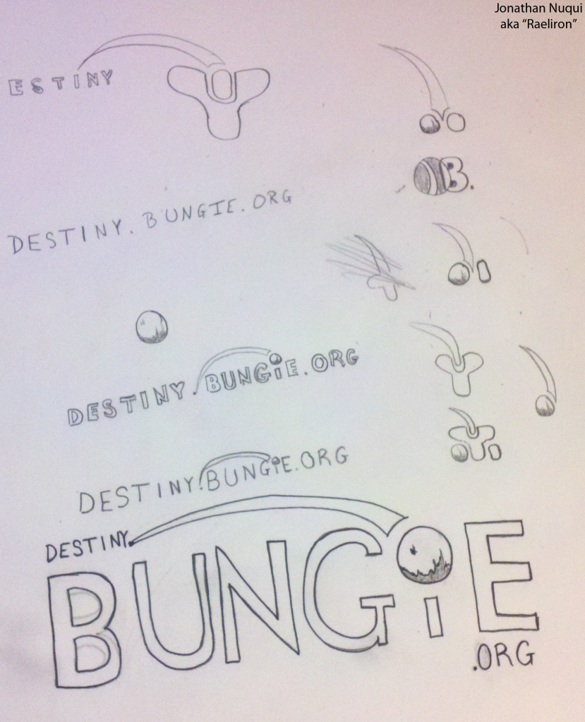
by Raeliron, Thursday, February 28, 2013, 12:32 (4073 days ago) @ ncsuDuncan
Alright. So I don't have a scanner nor one big enough to put this into one, but I took a picture instead. Below is a link to the picture of ideas I had for the logo. Please let me know what you guys think. I am very open to critiquing. I understand it's a bit dirty, but it's a rough draft. My B's are horrible looking, I know, but this is just the first draft of what I was thinking. The bottom one with Bungie is what I was thinking about for the logo.
Thoughts are welcome :)
DBO Logo Hunt, continued.
by Claude Errera ![]() , Thursday, February 28, 2013, 12:55 (4073 days ago) @ Raeliron
, Thursday, February 28, 2013, 12:55 (4073 days ago) @ Raeliron
Alright. So I don't have a scanner nor one big enough to put this into one, but I took a picture instead. Below is a link to the picture of ideas I had for the logo. Please let me know what you guys think. I am very open to critiquing. I understand it's a bit dirty, but it's a rough draft. My B's are horrible looking, I know, but this is just the first draft of what I was thinking. The bottom one with Bungie is what I was thinking about for the logo.
Thoughts are welcome :)
It's nice work - but as has been said elsewhere, we're not going to incorporate any aspects of Bungie's corporate logo in the final product. That swoosh is a no-go. :(
DBO Logo Hunt, continued.
by Supranutz, Thursday, February 28, 2013, 15:20 (4073 days ago) @ ncsuDuncan
![[image]](http://sphotos-h.ak.fbcdn.net/hphotos-ak-snc6/v/184087_4520140997963_1326364210_n.jpg?oh=47cdbef37be3e38e402f263344a3728d&oe=51319662&__gda__=1362283767_d4ba1089b72cabbf48f5fb6c17dde4bb)
I did some researches, lemme know if there's something you like (:
DBO Logo Hunt, continued.
by kapowaz, Thursday, February 28, 2013, 19:41 (4073 days ago) @ Supranutz
I did some researches, lemme know if there's something you like (:
It's a shame none of these incorporate the b.org logo somehow; I think there's definitely potential to this style. If you could do some more experiments and include it, maybe it would be a contender...?
DBO Logo Hunt, My Design!
by Noble, Thursday, February 28, 2013, 15:36 (4073 days ago) @ ncsuDuncan
Just click here for the image Thanks ill be sending more!
DBO Logo Hunt, continued.
by TheWhat, Thursday, February 28, 2013, 15:37 (4073 days ago) @ ncsuDuncan
![[image]](http://i869.photobucket.com/albums/ab255/TheLoge001/DestinyBungieOrgLogoLarger.png)
How about something like this? Only with more detail, I whipped this up in paint. DBO is incorporated in the two center lightening bolts and the circle of course. The top circle could be the Traveler to signify it hovering over humanity, or the large circle could be the Traveler as a backdrop.
DBO Logo Hunt, continued.
by Noble, Thursday, February 28, 2013, 15:42 (4073 days ago) @ ncsuDuncan
here is a version with no bg im sorry about that.. here it is! Image
DBO Logo Hunt, continued.
by Aseric, Thursday, February 28, 2013, 16:23 (4073 days ago) @ ncsuDuncan
DBO Logo Hunt, continued.
by Chewbaccawakka ![]() , The Great Green Pacific Northwest!, Thursday, February 28, 2013, 16:31 (4073 days ago) @ Aseric
, The Great Green Pacific Northwest!, Thursday, February 28, 2013, 16:31 (4073 days ago) @ Aseric
![[image]](http://i1273.photobucket.com/albums/y413/Aseric/dbo_zpsc545f193.jpg)
Er...
Was that on purpose? That's gotta be on purpose. Right?
DBO Logo Hunt, continued.
by Aseric, Thursday, February 28, 2013, 16:43 (4073 days ago) @ Chewbaccawakka
umb no. I did it really quick and once i posted it i seen it and started laughing. lol my bad.
DBO Logo Hunt, continued.
by Aseric, Thursday, February 28, 2013, 16:48 (4073 days ago) @ Aseric
DBO Logo Hunt, continued.
by jeebs3000, Thursday, February 28, 2013, 16:41 (4073 days ago) @ ncsuDuncan
DBO Logo Hunt, continued.
by Noble, Thursday, February 28, 2013, 16:44 (4073 days ago) @ jeebs3000
I like it.. i was thinking of some way to make it better and im not seeing it.. this is good!
DBO Logo Hunt, continued.
by Aseric, Thursday, February 28, 2013, 16:51 (4073 days ago) @ Noble
I agree. It's simple and looks good.
DBO Logo Hunt, continued.
by Noble, Thursday, February 28, 2013, 16:58 (4073 days ago) @ Aseric
im jealous i didn't make it lol
DBO Logo Hunt, continued.
by jeebs3000, Friday, March 01, 2013, 07:58 (4073 days ago) @ Noble
Thx for the kind words gents. It's all subjective and based on all the good works already delivered. Hopefully, I am adding something positive to the conversation.
DBO Logo Hunt, continued.
by Halcylon, Thursday, February 28, 2013, 17:16 (4073 days ago) @ jeebs3000
DBO Logo Hunt, continued.
by ncsuDuncan ![]() , Thursday, February 28, 2013, 17:50 (4073 days ago) @ Halcylon
, Thursday, February 28, 2013, 17:50 (4073 days ago) @ Halcylon
Walk him and pitch to the elephant!
<3 Hot Shots.
DBO Logo Hunt, continued.
by kapowaz, Thursday, February 28, 2013, 19:44 (4073 days ago) @ jeebs3000
If yours looks like that... go see a doctor ;)
by Xenos ![]() , Shores of Time, Thursday, February 28, 2013, 19:58 (4073 days ago) @ kapowaz
, Shores of Time, Thursday, February 28, 2013, 19:58 (4073 days ago) @ kapowaz
- No text -
DBO Logo Hunt, continued.
by thebruce ![]() , Ontario, Canada, Friday, March 01, 2013, 07:44 (4073 days ago) @ jeebs3000
, Ontario, Canada, Friday, March 01, 2013, 07:44 (4073 days ago) @ jeebs3000
Yeah, I like the you put the letters together... and it leaves the "o" free to become the Traveler, or the BOrg logo, or some other circle-variant element.
Of the 'letter' style designs, I think I'd call this my current favourite.
DBO Logo Hunt, continued.
by jeebs3000, Friday, March 01, 2013, 08:01 (4073 days ago) @ thebruce
I commend you on your skills of observation! The simplicity is meant to add an element of modularity and scalability if it did need accessorizing (but I think things should remain as simple as can be, shhh).
DBO Logo Hunt, continued.
by Sam, Tuesday, March 05, 2013, 11:25 (4068 days ago) @ jeebs3000
I like this one, more unique use of the letters.
Variation on a theme
by kapowaz, Tuesday, March 05, 2013, 13:18 (4068 days ago) @ jeebs3000
It doesn't have the b.org logo, so I guess it's no use to the overall objective, but I had a bit of fun creating this from your idea:
![[image]](http://i.imgur.com/kgNDQ09.png)
Monkey in the window!
by Claude Errera ![]() , Tuesday, March 05, 2013, 13:20 (4068 days ago) @ kapowaz
, Tuesday, March 05, 2013, 13:20 (4068 days ago) @ kapowaz
- No text -
DBO Logo Hunt, continued.
by Anroll, Thursday, February 28, 2013, 17:17 (4073 days ago) @ ncsuDuncan
edited by Anroll, Thursday, February 28, 2013, 17:20
![[image]](http://i.imgur.com/6o1by0p.png)
Hey!, i'm new, i'm from b.net.
I just made this tattoo-like thing, i don't think it's much of a logo, but you can use it if you want to make a new logo.
DBO Logo Hunt, continued.
by Kermit ![]() , Raleigh, NC, Thursday, February 28, 2013, 17:33 (4073 days ago) @ ncsuDuncan
, Raleigh, NC, Thursday, February 28, 2013, 17:33 (4073 days ago) @ ncsuDuncan
![]()
![]()
My faves are as follows.
Non-Bungie.org logos
I doubt these will be used as the official one, but I love them regardless.
B3 and J3 are awesome.
Also like this newcomer:
![[image]](http://farm9.staticflickr.com/8093/8517531578_9ddcf36ee0.jpg)
My favorite without the O is C9. Just great. It won't surprise you that I also love H5.
Want each on a shirt now.
Bungie.org logos incorporated
First, ones that I think are great, but not necessarily as a logo.
C4 is fantastic. Loses a lot in smaller sizes, though. Must have that patch.
I also love a late variation of E7
The creme de la creme
The big D's rule, especially the first one--D7. It's so perfect.
Although I had a guiding hand in D9, it ended up looking a tad cluttered. I can't help but wonder how it might look if took the D away, similar to this later effort:
(Sorry, the rubber pencil still stops me, but I could get used to it.)
Finally, there's A3, which is great. I can't decide whether I like the fact that I don't quite recognize the B.org logo, but it's a nice (literal) twist. Hat's off.
My favorite is probably still H4, which I was finally sold on because of how it looked in black and white (J6). The J6 version has a bigger b.org logo, though, and loses a bit of its Marathon evocativeness.
Great work all around.
Kermit
One last time..
by breitzen ![]() , Kansas, Thursday, February 28, 2013, 19:54 (4073 days ago) @ Kermit
, Kansas, Thursday, February 28, 2013, 19:54 (4073 days ago) @ Kermit
edited by breitzen, Thursday, February 28, 2013, 19:58
If for no other reason than to try and satisfy Kermit's thirst. :)
The smaller version has been edited to account for the smaller size. (Simpler ship, longer contrail, and wider white sections guiding the contrail).
![[image]](http://i1277.photobucket.com/albums/y490/breitzen/ScreenShot2013-02-28at95145PM_zps591f8f3e.png)
One last time..
by Kermit ![]() , Raleigh, NC, Thursday, February 28, 2013, 20:06 (4073 days ago) @ breitzen
, Raleigh, NC, Thursday, February 28, 2013, 20:06 (4073 days ago) @ breitzen
If for no other reason than to try and satisfy Kermit's thirst. :)
I'm insatiable!
I'd be very happy with this one. I've enjoyed the collaboration, everyone.
One last time..
by kapowaz, Thursday, February 28, 2013, 20:13 (4073 days ago) @ breitzen
If for no other reason than to try and satisfy Kermit's thirst. :)
The smaller version has been edited to account for the smaller size. (Simpler ship, longer contrail, and wider white sections guiding the contrail).
I like this, but I still don't feel wild about the ship. It seems to look less like a space-travelling fighter craft and more like a thorn or splintered piece of wood. I think it could be made simpler (and thus more distinctive at smaller sizes). Also, how about some negative space between it and the contrail, to distinguish ship from trail? If the bumps/spikes around the aft of the ship are meant to be jet plumes or something then this could be separate too?
Any way to incorporate the Traveler?
by Mid7night ![]()
![]() , Rocket BSCHSHCSHSHCCHGGH!!!!!!, Thursday, February 28, 2013, 20:21 (4073 days ago) @ kapowaz
, Rocket BSCHSHCSHSHCCHGGH!!!!!!, Thursday, February 28, 2013, 20:21 (4073 days ago) @ kapowaz
I tried with my entry, but I lost a bit of the original HBO sphere. Maybe you could take a stab at it?
This is just a flipped=horizontal version of B7, to match your orientation, which I like:
![[image]](http://i.imgur.com/hJ1N1Us.jpg)
LOVE it :D
by Mid7night ![]()
![]() , Rocket BSCHSHCSHSHCCHGGH!!!!!!, Thursday, February 28, 2013, 20:15 (4073 days ago) @ breitzen
, Rocket BSCHSHCSHSHCCHGGH!!!!!!, Thursday, February 28, 2013, 20:15 (4073 days ago) @ breitzen
Seriously, I LOVE this one! It harkens back to the old DC Jets logo, of which I am very fond, and it's closest to one that I was trying to make with the Traveler in B7.
Awesome!
An ideation sketch
by dlau, Thursday, February 28, 2013, 18:55 (4073 days ago) @ ncsuDuncan
Here's a quick sketch of what I was thinking:
![[image]](http://i1296.photobucket.com/albums/ag7/dlnreq/IMAG0485_zps004686f0.jpg)
I wanted to use the elliptical path to give some depth to the image and to represent a planetary orbit while also giving it a vague appearance of incorporating the bungie.net logo.
Nice concept! *NM*
by Xenos ![]() , Shores of Time, Thursday, February 28, 2013, 19:06 (4073 days ago) @ dlau
, Shores of Time, Thursday, February 28, 2013, 19:06 (4073 days ago) @ dlau
- No text -
DBO Logo Hunt, continued.
by Playdoh_Soldier, Thursday, February 28, 2013, 18:58 (4073 days ago) @ ncsuDuncan
edited by Playdoh_Soldier, Thursday, February 28, 2013, 19:16
Hi Guys,
I have come up with a few concepts. Hope someone likes them :) & if not it was fun anyway. There are 3 concepts on the 1 photobucket page.
http://i1150.photobucket.com/albums/o610/Unrelenting_Fork/DBO-Concept-1.jpg
Also for the ones currently showing, I like 5F & 5G from the top section.
The just seem to work. Though so many of the images are great, it was really hard to choose, so many talented people out there :)
Cheers
Playdoh_Soldier
Concept 3 is the same as concept 1
by Xenos ![]() , Shores of Time, Thursday, February 28, 2013, 19:08 (4073 days ago) @ Playdoh_Soldier
, Shores of Time, Thursday, February 28, 2013, 19:08 (4073 days ago) @ Playdoh_Soldier
I believe you meant to post this one:
http://s1150.beta.photobucket.com/user/Unrelenting_Fork/media/DBO-Concept-3.jpg.html
Concept 3 is the same as concept 1
by Playdoh_Soldier, Thursday, February 28, 2013, 19:11 (4073 days ago) @ Xenos
Yeah lol sorry.
This is my first time posting on this type of forum. So yeah, a little confusing.
All 3 of my images should be on my photobucket.
Cheers
Concept 3 is the same as concept 1
by Xenos ![]() , Shores of Time, Thursday, February 28, 2013, 19:12 (4073 days ago) @ Playdoh_Soldier
, Shores of Time, Thursday, February 28, 2013, 19:12 (4073 days ago) @ Playdoh_Soldier
You actually have an hour to edit the post if you want to fix it :-D
Concept 3 is the same as concept 1
by Playdoh_Soldier, Thursday, February 28, 2013, 19:17 (4073 days ago) @ Xenos
Sweet :D
Edited, thank you for the info
And the preview button :)
by thebruce ![]() , Ontario, Canada, Friday, March 01, 2013, 07:48 (4073 days ago) @ Xenos
, Ontario, Canada, Friday, March 01, 2013, 07:48 (4073 days ago) @ Xenos
- No text -
DBO Logo Hunt, My Logo Design
by DrJBird, Thursday, February 28, 2013, 19:08 (4073 days ago) @ ncsuDuncan
![[image]](http://i40.photobucket.com/albums/e222/Jbird85/DBO_design1067.jpg)
Im new hear, Heres my first design.
If you look very closely the logo resemble an alien face
If you turn the logo 90 degrees, it resembles the letter "D"
DBO Hunt:
A5- This Design will do great for a t-shirt but not so much as a logo
F5- Another good example of logos without the use of text
DBO Logo Hunt, continued.
by Salpygidis, Thursday, February 28, 2013, 21:08 (4073 days ago) @ ncsuDuncan
![]()
Here is my submission
Some kind of Marathon
by MrPadraig08 ![]()
![]() , Steel City, Thursday, February 28, 2013, 21:55 (4073 days ago) @ ncsuDuncan
, Steel City, Thursday, February 28, 2013, 21:55 (4073 days ago) @ ncsuDuncan
![[image]](http://i.imgur.com/Y0gOlTi.png)
I made a recent draft based on a few idea I've seen kicked around.
Based on the Marathon logo, wish I had more time to flesh it out a bit.
DBO, questioning the halo
by ScuffMuffin, Friday, March 01, 2013, 00:26 (4073 days ago) @ ncsuDuncan
Food for thought. I like a lot of these designs, but one thing is bugging me about many of them. There is the reoccurring theme of a halo shape in a good portion of the designs. A halo is a very recognizable symbol, one people may associate with Halo. I don't feel like a halo should be apparent in its logo. It might just be me, i never was a Halo player. DBO is unique and i think its symbol should reflect that, and i'm sure it will regardless of what icon is used. good work all.
Achievement unlocked: b.org latecomer
by kapowaz, Friday, March 01, 2013, 00:32 (4073 days ago) @ ScuffMuffin
See posts by others on this passim. tl;dr - the logo with the ring predates Halo and is actually the logo for bungie.org.
Achievement unlocked: feeling really dumb
by ScuffMuffin, Friday, March 01, 2013, 02:07 (4073 days ago) @ kapowaz
edited by ScuffMuffin, Friday, March 01, 2013, 02:17
huh... guess i should have looked that one up. If that's the case by all means, halo away in the designs.that achievement was worth looking stupid.
Achievement unlocked: feeling really dumb
by kapowaz, Friday, March 01, 2013, 02:41 (4073 days ago) @ ScuffMuffin
huh... guess i should have looked that one up. If that's the case by all means, halo away in the designs.that achievement was worth looking stupid.
Don't feel bad — it's totally understandable people would assume it had Halo connotations, particularly as the vast majority of people on here are going to be post-Halo Bungie fans!
Never too late for ideas
by ScuffMuffin, Friday, March 01, 2013, 03:00 (4073 days ago) @ kapowaz
edited by ScuffMuffin, Friday, March 01, 2013, 03:04
Thanks kapowaz. now i don't feel so lame, but since i've stayed up this late, here you go. this is my concept for the DBO logo.
![[image]](http://i.imgur.com/DzIlERy.jpg)
Holy big... sorry bout that
- No text -
DBO, questioning the halo
by ZackDark ![]() , Not behind you. NO! Don't look., Friday, March 01, 2013, 06:34 (4073 days ago) @ ScuffMuffin
, Not behind you. NO! Don't look., Friday, March 01, 2013, 06:34 (4073 days ago) @ ScuffMuffin
Funny thing.
While I agree that there is definitely a way of seeing a Halo there, I've always seen it as a left-facing bowl (with a very thin ring around it) on the right and a crescent moon on the left.
DBO, questioning the halo
by thebruce ![]() , Ontario, Canada, Friday, March 01, 2013, 07:53 (4073 days ago) @ ZackDark
, Ontario, Canada, Friday, March 01, 2013, 07:53 (4073 days ago) @ ZackDark
Funny thing.
While I agree that there is definitely a way of seeing a Halo there, I've always seen it as a left-facing bowl (with a very thin ring around it) on the right and a crescent moon on the left.
Same... though I don't think of it as a crescent moon on the left really, just more like the whole is a diagram of a sliced sphere with a ring over the right portion, with the white segmentation just being an element of the 'design' to make the separation stand out :P
For me, it takes some deep concentration to make the negative space of the white 'ring' become a right-facing ring in front of a sphere (with an odd white ovular object somewhere between the two o_O) heh
DBO, questioning the halo
by Kermit ![]() , Raleigh, NC, Friday, March 01, 2013, 08:26 (4073 days ago) @ thebruce
, Raleigh, NC, Friday, March 01, 2013, 08:26 (4073 days ago) @ thebruce
Yeah, I was familiar with logo before Halo, but even I started to see the Halo in it just by association.
This has relevance today. I'm not in the camp that says there needs to be an obvious visual representation of the Traveler in the logo. I kind of think that it's better for it not to be. But I bet dollars to doughnuts that (assuming that some variant of the b.org logo is used) 10 years from now when [nextIPname].bungie.org kicks off and they're looking for a logo, someone will argue that the b.org logo is no longer appropriate because the sphere is obviously supposed to be the traveler.
DBO, questioning the halo
by Kermit ![]() , Raleigh, NC, Friday, March 01, 2013, 09:45 (4073 days ago) @ Kermit
, Raleigh, NC, Friday, March 01, 2013, 09:45 (4073 days ago) @ Kermit
About traveler iconography ...
Could someone make a version of the b.org logo where the outer crescents are white (outlined in black)?
I know there are many variations of this already, but those usually included "damage" of some sort. That's not what I mean.
DBO, questioning the halo
by breitzen ![]() , Kansas, Friday, March 01, 2013, 10:13 (4073 days ago) @ Kermit
, Kansas, Friday, March 01, 2013, 10:13 (4073 days ago) @ Kermit
I can get on that when I get home from work but it seems simple enough that if someone else can get to it first, be my guest.
DBO, questioning the halo
by thebruce ![]() , Ontario, Canada, Friday, March 01, 2013, 10:33 (4072 days ago) @ Kermit
, Ontario, Canada, Friday, March 01, 2013, 10:33 (4072 days ago) @ Kermit
About traveler iconography ...
Could someone make a version of the b.org logo where the outer crescents are white (outlined in black)?
I know there are many variations of this already, but those usually included "damage" of some sort. That's not what I mean.
You mean something like this?
![[image]](http://i.imgur.com/mgh5v02.png)
Not quite sure what you mean...
DBO, questioning the halo
by Kermit ![]() , Raleigh, NC, Friday, March 01, 2013, 12:00 (4072 days ago) @ thebruce
, Raleigh, NC, Friday, March 01, 2013, 12:00 (4072 days ago) @ thebruce
About traveler iconography ...
Could someone make a version of the b.org logo where the outer crescents are white (outlined in black)?
I know there are many variations of this already, but those usually included "damage" of some sort. That's not what I mean.
You mean something like this?
Yep, except the outlines being thinner and including the inner edge of the crescents. This would help retain the effect of making the left outer edge of the middle hoop seem to be in the foreground. Your example highlights something, though. This isn't the original b.org logo.
To me, something seemed not right about A3, and I think it's that you've altered the b.org logo so the white spaces at the top and bottom of the hoop are larger, such that the bottom of the bowl seems to be on the right. I always saw the bottom of the bowl as being on the left, but the optical illusion quality of it is part of it's charm. The bowl could turn either direction, but it seems less so in your version.
![[image]](http://1.bp.blogspot.com/-R5eIb119z3I/UM3iJYHsM0I/AAAAAAAACD8/ApqJm14cnE4/s264/borglogo_big.png)
What I'm imagining is very similar to what the admins first envisioned, but not overtly invoking the Traveler as much.
Kermit
DBO, questioning the halo
by thebruce ![]() , Ontario, Canada, Friday, March 01, 2013, 12:22 (4072 days ago) @ Kermit
, Ontario, Canada, Friday, March 01, 2013, 12:22 (4072 days ago) @ Kermit
Yep, except the outlines being thinner and including the inner edge of the crescents. This would help retain the effect of making the left outer edge of the middle hoop seem to be in the foreground.
So like this?
![[image]](http://i.imgur.com/yc6X5Fu.png)
Your example highlights something, though. This isn't the original b.org logo.
To me, something seemed not right about A3, and I think it's that you've altered the b.org logo so the white spaces at the top and bottom of the hoop are larger, such that the bottom of the bowl seems to be on the right. I always saw the bottom of the bowl as being on the left, but the optical illusion quality of it is part of it's charm. The bowl could turn either direction, but it seems less so in your version.
Ah, interesting... yeah somehow a vector variant of the logo I used for A3 had a smaller inner sphere; or larger ring... not sure which. The difference is negligible, but here's the updated A3 with the smaller "white spaces"
![[image]](http://i.imgur.com/5Iz3NXD.png)
DBO, questioning the halo
by Kermit ![]() , Raleigh, NC, Friday, March 01, 2013, 15:46 (4072 days ago) @ thebruce
, Raleigh, NC, Friday, March 01, 2013, 15:46 (4072 days ago) @ thebruce
Yeah, that's closer to what I had in mind.
I like the updates to your logo, subtle as they are--especially the version with words.
It's weird how I've always seen the bowl as white on the outside and dark on the inside, but with yours I now see it as flipped.
Good work, theBruce.
Until about middle school I alternated between wanting to be a writer and wanting to be an artist. This thread has made me wish I'd stuck with the latter.
Kermit
DBO, questioning the halo
by thebruce ![]() , Ontario, Canada, Friday, March 01, 2013, 16:06 (4072 days ago) @ Kermit
, Ontario, Canada, Friday, March 01, 2013, 16:06 (4072 days ago) @ Kermit
It's weird how I've always seen the bowl as white on the outside and dark on the inside, but with yours I now see it as flipped.
Mission accomplished! lol
Until about middle school I alternated between wanting to be a writer and wanting to be an artist. This thread has made me wish I'd stuck with the latter.
heh, I was more fine-artistic through school, but moved on to programming as I got older... web development/graphic design is a nice happy middle :)
I blame my parents. When I was so much the young, one year I was given a choice between two big birthday gifts - a telescope or my own computer. Sometimes I wonder... what would life have been like had I pursued the alternate hobby?
Ever have that kind of crossroads? Fun to ponder sometimes :)
/sorry, straying too far enough off topic... =P
This one is beautiful!!
by katancik ![]()
![]() , Portland, OR/ University of Texas, Saturday, March 02, 2013, 15:17 (4071 days ago) @ thebruce
, Portland, OR/ University of Texas, Saturday, March 02, 2013, 15:17 (4071 days ago) @ thebruce
- No text -
DBO Logo Hunt, continued.
by Tday42, Friday, March 01, 2013, 10:06 (4073 days ago) @ ncsuDuncan
H7 is a good one but I think E2 is better if it incorporated the DBO letters either as part of the D or the O.
TDay42
No smoke on the horizon…
by kapowaz, Sunday, March 03, 2013, 23:36 (4070 days ago) @ ncsuDuncan
Was a consensus reached? I think I speak for all people who've contributed here in saying that we're curious to see what has been decided.
Working on it. Took me a while to get all of the entries collected and organized by style - I wanted to make sure every image submitted (every variant, even) was included in the final folder before we started picking favorites.
Shouldn't be much longer; sorry for the delay!
DBO Logo Hunt, My New Logo
by stokies76, Monday, March 04, 2013, 13:38 (4069 days ago) @ ncsuDuncan
![[image]](http://i195.photobucket.com/albums/z215/danbakuk_2007/22222_zpsb8a9fe76.png)
DBO Logo Hunt, My New Logo
by Kermit ![]() , Raleigh, NC, Monday, March 04, 2013, 13:40 (4069 days ago) @ stokies76
, Raleigh, NC, Monday, March 04, 2013, 13:40 (4069 days ago) @ stokies76
As a piece of art in general, that's pretty frickin' sweet.
Nice!
by Ragashingo ![]() , Official DBO Cryptarch, Monday, March 04, 2013, 15:11 (4069 days ago) @ stokies76
, Official DBO Cryptarch, Monday, March 04, 2013, 15:11 (4069 days ago) @ stokies76
- No text -
DBO Logo Hunt, continued.
by stokies76, Tuesday, March 05, 2013, 08:00 (4069 days ago) @ ncsuDuncan
I started this one and ran out of inspiration for it.... maybe some one else has ideas...
![[image]](http://i195.photobucket.com/albums/z215/danbakuk_2007/1_zps4ae479a5.png)
DBO Logo Hunt, continued.
by boots12344, Wednesday, March 06, 2013, 09:32 (4068 days ago) @ ncsuDuncan
edited by boots12344, Wednesday, March 06, 2013, 09:57
Hey guys, this is my first time posting here. I came up with one concept design so far for the logo. Haha, feedback's always appreciated, so if you see something you wanna change, just tell me, and I'll check it out :)
Here's the link:
http://s1298.beta.photobucket.com/user/Filip_Butula/media/destiny_zps547ac7b0.jpg.html
Hope you guys like it!
DBO Logo Hunt, continued.
by General Vagueness ![]() , The Vault of Sass, Wednesday, March 06, 2013, 14:59 (4067 days ago) @ boots12344
, The Vault of Sass, Wednesday, March 06, 2013, 14:59 (4067 days ago) @ boots12344
Hey guys, this is my first time posting here. I came up with one concept design so far for the logo. Haha, feedback's always appreciated, so if you see something you wanna change, just tell me, and I'll check it out :)
Here's the link:
http://s1298.beta.photobucket.com/user/Filip_Butula/media/destiny_zps547ac7b0.jpg.html
Hope you guys like it!
It looked good until I realized it reminded me a lot of the Pepsi logo. It still looks good, but that resemblance doesn't seem like a good thing.
DBO Logo Hunt, continued.
by boots12344, Wednesday, March 06, 2013, 21:06 (4067 days ago) @ General Vagueness
Oh man, haha, good call. Yeaaah, I see it too now. Is it mainly the colors that put it off? Or is the shape just too much like a pepsi logo? Thanks for pointing that out by the way. Having Destiny become a pepsi brand by accident probably wouldn't have worked out ;)
DBO Logo Hunt, continued.
by kapowaz, Thursday, March 07, 2013, 00:15 (4067 days ago) @ General Vagueness
It looked good until I realized it reminded me a lot of the Pepsi logo.
![]()
What, because it's circular? Because it uses blue and red? Because apart from these things it bears almost no resemblance.
DBO Logo Hunt, continued.
by boots12344, Thursday, March 07, 2013, 00:39 (4067 days ago) @ kapowaz
Heres a new one I made. I went away from the Pepsi design a bit and decided to start from scratch and see what happens. I think I like this one more
http://s1298.beta.photobucket.com/user/Filip_Butula/media/destiny3_zps7b1d5d98.jpg.html?sort=3&o=0
DBO Logo Hunt, continued.
by General Vagueness ![]() , The Vault of Sass, Saturday, March 09, 2013, 20:40 (4064 days ago) @ boots12344
, The Vault of Sass, Saturday, March 09, 2013, 20:40 (4064 days ago) @ boots12344
I like it. I think you overdid it on the dirt, but the actual design is pretty good, I think.
DBO Logo Hunt, continued.
by General Vagueness ![]() , The Vault of Sass, Saturday, March 09, 2013, 20:37 (4064 days ago) @ kapowaz
, The Vault of Sass, Saturday, March 09, 2013, 20:37 (4064 days ago) @ kapowaz
It looked good until I realized it reminded me a lot of the Pepsi logo.
What, because it's circular? Because it uses blue and red? Because apart from these things it bears almost no resemblance.
It's both of those together, and how there's a strip of white separating the red and blue. That and I was thinking of their previous logo. >_>
DBO Logo Hunt, continued.
by HAIRY POPPINS, Friday, March 08, 2013, 06:11 (4066 days ago) @ ncsuDuncan
Am I being stupid? How do you upload an image to this thread?
DBO Logo Hunt, continued.
by kapowaz, Friday, March 08, 2013, 06:52 (4066 days ago) @ HAIRY POPPINS
Am I being stupid? How do you upload an image to this thread?
You can't — you'll need to use an external image host (I recommend imgur) then link to it using the BBCode for embedding an image (the syntax is over on the right when you post).
DBO Logo Hunt, continued.
by HAIRY POPPINS, Friday, March 08, 2013, 07:06 (4066 days ago) @ kapowaz
Cheers.
DBO Logo Hunt, continued.
by HAIRY POPPINS, Friday, March 08, 2013, 07:08 (4066 days ago) @ ncsuDuncan
Hi,
Just some designs I thought could progress this topic. Keep it clean and simple.
OR
http://i.imgur.com/vyLgOiW.jpg
Thanks
DBO Logo Hunt, continued.
by General Vagueness ![]() , The Vault of Sass, Saturday, March 09, 2013, 20:44 (4064 days ago) @ HAIRY POPPINS
, The Vault of Sass, Saturday, March 09, 2013, 20:44 (4064 days ago) @ HAIRY POPPINS
I like these. I particularly like the top middle one, and it would probably be the "safest"-- there wasn't supposed to be anything copyrighted by Bungie in these. The swoosh was specifically ruled out before and I think the "BUNGiE" stylizing might not be let through either, but I like it better without the explicit swoosh or the "BUNGiE" anyway. If you used the font from the top left one on the top middle design I think it would be even better... you might have to/want to move the initials or increase their thickness a little though.
Just when I thought I was out…
by kapowaz, Friday, March 08, 2013, 10:56 (4065 days ago) @ ncsuDuncan
…they pull me back in.
So, at the eleventh hour I have another candidate for this whole logo thing. Here it is:
![[image]](http://i.imgur.com/Yjgad30.png)
I've made a few other variations (including the mission patches from before) which you can see here.
I like it better than the plain D logo.
by Malagate ![]() , Sea of Tranquility, Friday, March 08, 2013, 11:01 (4065 days ago) @ kapowaz
, Sea of Tranquility, Friday, March 08, 2013, 11:01 (4065 days ago) @ kapowaz
- No text -
Just when I thought I was out…
by Kermit ![]() , Raleigh, NC, Friday, March 08, 2013, 11:01 (4065 days ago) @ kapowaz
, Raleigh, NC, Friday, March 08, 2013, 11:01 (4065 days ago) @ kapowaz
It's nutty. I like it!
Okay, there's a lot I like about this design. If you look at it right, it incorporates a letter "D" inside the hexagon, but it's subtle.
I immediately had one idea that I just had to try out -- I hope you don't mind. Adding a "moon" to the B.org "planet" here feels like it completes the picture for me. The hexagon shape gives an anchor for the moon to live on, and the spaceship is already on trajectory to go there!
![[image]](http://i.imgur.com/HwOW11C.png)
Can you do one without the ribbon/ship?
DBO: We got rubber pencils
by thebruce ![]() , Ontario, Canada, Friday, March 08, 2013, 12:09 (4065 days ago) @ Kermit
, Ontario, Canada, Friday, March 08, 2013, 12:09 (4065 days ago) @ Kermit
- No text -
Shiny!
by ZackDark ![]() , Not behind you. NO! Don't look., Friday, March 08, 2013, 13:24 (4065 days ago) @ Beorn
, Not behind you. NO! Don't look., Friday, March 08, 2013, 13:24 (4065 days ago) @ Beorn
Slingshotting to the moon, heh?
I like it.
No, in fact, I love it.